How to Write an AI Poster Prompt: Start with the Reading Order
Turn vague style requests into clear poster instructions. A complete prompt, layout diagrams, and a focused edit show how to set a reading order.
By PixOnDeck ·
“Premium, minimal, well designed, visually striking.”
Those words seem reasonable enough in an AI poster prompt. But when the image arrives, it's still possible to have no idea how to explain what's wrong with it. So the next request becomes “make it more premium.”
I'd put those adjectives aside for a moment and look at the information on the poster.
Working on interfaces has made me pay attention to what someone notices first, what they read next, and what can afford to be quieter. I find that a useful way to look at posters, too.
A prompt that leaves too much undecided
Here's a fictional design event. The layouts in this article are teaching diagrams, not before-and-after model outputs.
Create a poster for a design event called DESIGN WEEKEND.
Make it premium, minimal, and well designed. Include geometric shapes.
Use bold typography and strong visual impact.
It should work well on social media.
There is a style direction here, but quite a lot is still open.
Should DESIGN WEEKEND be on one line or two? Are the shapes the main attraction or supporting elements? Is there a subtitle? Where should the empty space be? Should someone notice the words or the graphic first?
An image can look good and still be a long way from the poster I had in mind when none of those questions has an answer.
For this example, I'd make one decision first: the event name gets the attention. The shape gives the poster a little character.
Turn the adjectives into visible choices
Here's what those broad descriptions mean for this particular poster:
| Original wording | What I actually want in this layout |
|---|---|
| Minimal | An event name, one supporting line, and one geometric shape |
| Visually striking | The event name takes up the most space; everything else is noticeably smaller |
| Bold typography | A two-line, left-aligned headline with space to its right |
| Well designed | A consistent type direction and margins; no graphic covering the text |
| Works on social media | The event name remains readable at a normal phone viewing size |
These aren't rules for every poster. For a photography exhibition, I might make the title much smaller and give the photograph more room. Here, the aim is to make the event name stick.
A more specific poster prompt
Create a portrait poster for a fictional design event
called DESIGN WEEKEND.

Include only the following text:
“DESIGN WEEKEND”
“Talks & Demos”

Information hierarchy:
The event name is the first thing the viewer should notice.
Set “DESIGN” and “WEEKEND” on two lines, aligned left.
Use “Talks & Demos” as supporting text,
noticeably smaller than the event name.

Composition:
Place the headline mainly in the upper half of the poster.
Place one simple abstract geometric shape in the lower half.
The shape must not overlap any text or attract more attention
than the headline.
Align the headline and supporting text to the same left edge.
Leave clear safe margins on all sides.

Visual direction:
White background and black text.
Use one blue for the geometric shape, with no other accent colors.
Use a clear, slightly distinctive bold sans-serif type style.

Do not include:
3D lettering, metallic reflections, gradient backgrounds,
glow effects, extra slogans, invented dates or addresses,
or decorative small print.
I'd treat this as a starting point, rather than a specification that can never change.
The useful part is being able to name what hasn't worked. If the title is too small, change the title. If the graphic takes over, adjust the graphic. “More premium” doesn't have to carry every complaint.
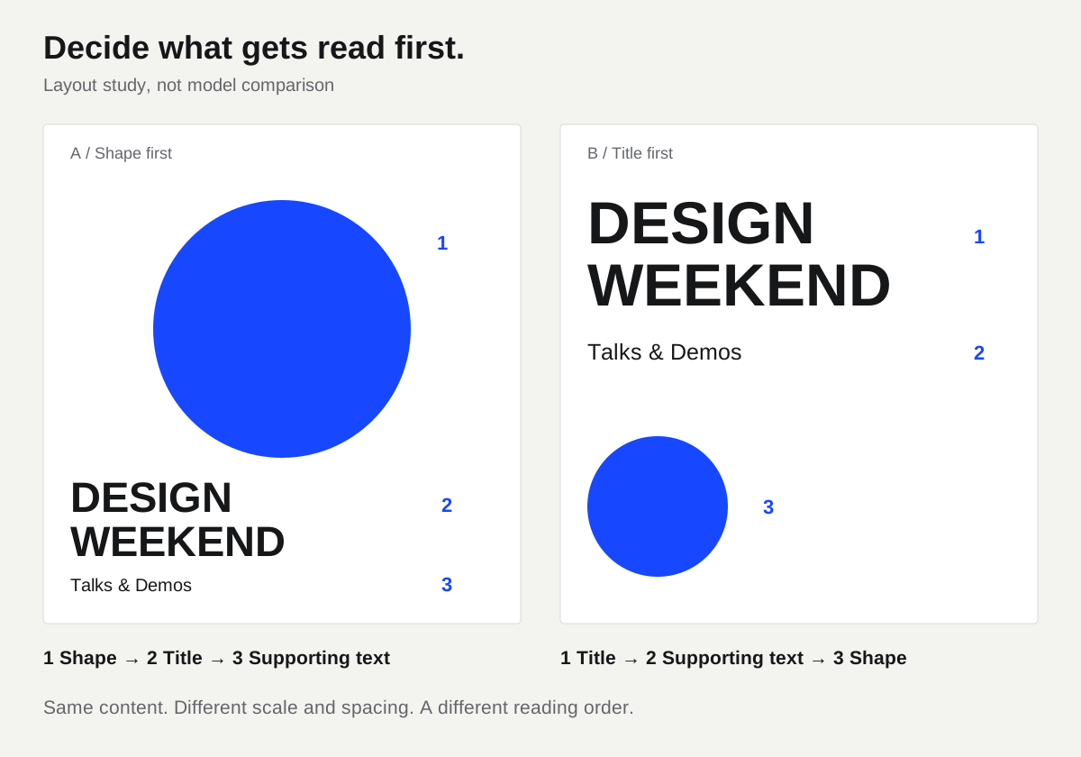
Layout teaching diagram: compare how much attention the words and shape receive. This is not a model comparison or a tested before-and-after result of the prompts.
Fix the biggest reading problem first
Suppose the title reads well, but the shape is still taking over. I'd download the current result and upload it again to the generator with this request:
Preserve the existing headline, supporting text, typography,
colors, and alignment.

Only adjust the blue geometric shape in the lower half:
make it smaller and leave more space around it,
so the event name remains the clearest visual focus.

Do not add shapes or change any of the wording.
Separating what should change from what should stay gives me a useful checklist. Even when the request only concerns the shape, I'd check the text and the rest of the image again.
I prefer to tackle one main problem at a time. It makes it easier to tell whether an edit is moving in the right direction.
That doesn't mean a prompt should keep getting longer. When I'm specifying individual letter spacing or exact alignment, I'd consider moving into a design tool. For this example, a useful composition and visual direction are already something I can work with.
That's also what I want PixOnDeck's recipes to help with: understanding the decisions behind an image, and knowing what to keep or change when replacing the content with your own.
The next time a poster feels off, look at it small. Identify the part that makes it hardest to read, then write a request about that part.
For a different brief, try the melo cinnamon roll concept poster. That one puts the product before the headline. The reading order still needs a decision.


