
AI Product Images: Check What Happened to the Product
A practical checklist for AI product images: compare shape, color, materials, and labels, with a complete prompt and a background-only workflow.
By PixOnDeck ·
I like a classic cinnamon roll. No frosting.
That makes one check fairly straightforward when working on an AI product image: a more appetizing picture isn't a good reason to add a topping the product doesn't have.
The same issue shows up with other products. A hair clip shouldn't acquire an extra row of decorations. A matte cup shouldn't become glossy. The capacity and model number on a label shouldn't turn into something else.
I'd look at a product image in two ways: does the picture appeal to me, and does it show the product accurately? Both matter.
This is a checking guide. The cinnamon roll brief is a teaching example, and there is no accompanying real product photograph and edited result. The diagram illustrates what to inspect; it is not a before-and-after test.
Start with a real photograph
For the roll, I'd start with a clear photograph in which nothing obscures the product.
It doesn't need an elaborate setting. It does need to show the outline, spiral layers, surface color, and any actual toppings.
If I wanted a completely different angle that the existing photo doesn't show, I'd take another photograph first. Particularly for a product page, I wouldn't want to present an invented structure as something the product really has.
The same applies elsewhere. To preserve packaging text, supply a readable label. To preserve a hair clip's construction, don't rely on a photograph where hair hides most of it.
Describe the product and its surroundings separately
In this example, I only want a different background that suits melo's blue-and-white direction. The roll itself doesn't need redesigning.
Use the uploaded photograph of a real cinnamon roll
to create a product presentation image.

Product:
Preserve the roll's actual shape, quantity, spiral layers,
baked color, and surface texture from the photograph.
Do not change its height-to-width proportions.
Do not add cream, frosting, fruit, nuts, or other toppings.
Do not make the surface look plastic or highly reflective.

Surroundings:
Change the background to a clean white setting.
You may add a small piece of blue paper beside the product
as a background accent.
It must not cover the product or cast a blue tint onto it.

Composition:
Keep the original camera angle.
Show the whole product without cropping its edges.
Leave some space for copy to be added later.

Text:
Do not generate text, logos, prices, or slogans in this step.
Putting the requirements into words wouldn't make me skip the check afterward.
A preservation request is no substitute for comparing the result with the original. Where product details need to remain accurate, I'd rather keep the original product layer and work on the background around it.
Compare the original and the result side by side
I'd start with the whole image, then look at details. For the cinnamon roll, I'd check for added toppings, a change in height or size, and a surface color that no longer resembles the product.
For other products, this is the checklist I'd use:
| Area | What to inspect |
|---|---|
| Shape and quantity | Outline, thickness, openings, and number of parts |
| Color and material | Color shifts and changes to matte, transparent, or metallic surfaces |
| Labels and markings | Brand name, capacity, model number, lettering, and graphics compared with the original |
| Product and props | Accessories that could look included in the purchase, or a setting that gives a misleading impression of size |
I'd pay particular attention to details that look better but are no longer the same.
A small hair clip in a setting without a clear sense of scale can seem much larger than it is. There may be no obvious visual mistake, but the image won't necessarily help a customer understand the size.
I'd include a separate image with the actual dimensions in that case.
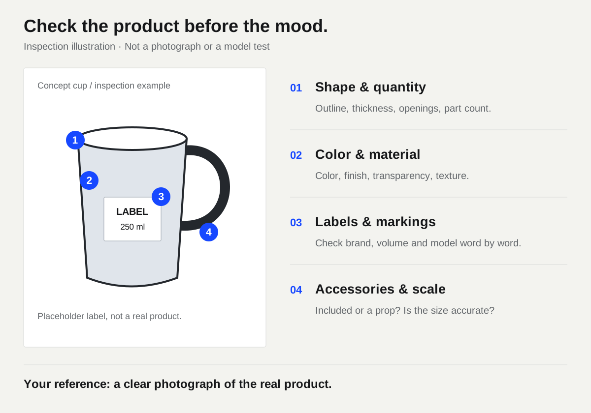
Illustrated checklist. No real product photograph is used here, and this is not an AI editing before-and-after comparison.
A new background doesn't have to mean a regenerated product
For a product whose outline, label, or texture must stay accurate, I'd consider another workflow: keep the product photograph, prepare the background, and combine them.
Cut out the product, check its edges, and place it on the new background. PixOnDeck's background remover can help with that step. After removing the background, check that fine parts, transparent areas, and edges haven't been removed too.
I'd try to make the background fit the photograph. A front-lit product in soft light is an awkward match for a scene with strong sunset light from the side. A slightly top-down product photo needs a compatible view of the surface underneath it. Otherwise, fixing the mismatch can turn into more changes to the product itself.
After working on the background, I'd add the official logo, price, and product information as editable layers in a design tool. Those details need to be accurate.
Separate the mood image from the product view
For brand content, I'd allow more freedom in the setting, composition, and props.
For a product page, I'd keep things quieter so it's easy to see what the product looks like. Clear photographs should be available to judge its actual size, color, and details.
For the melo roll, a white background, suitable light, and visible spiral layers are a reasonable starting point. There's no need to add something to the product just to fill the image.
If you're still exploring a brand and don't have a real product photograph, you can start with a concept poster exercise. Keeping concept images separate from actual product images makes the later choice of what to publish much clearer.


